Design system: Jigsaw (2023)
Building a design system from the ground up
Overview
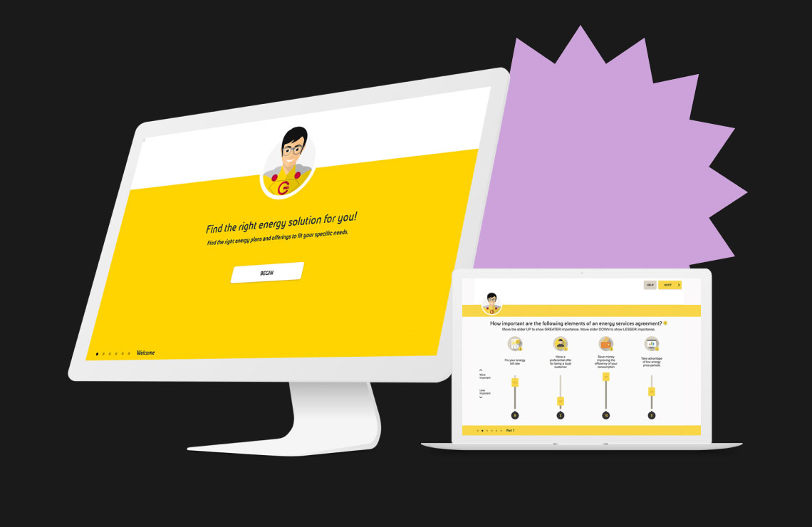
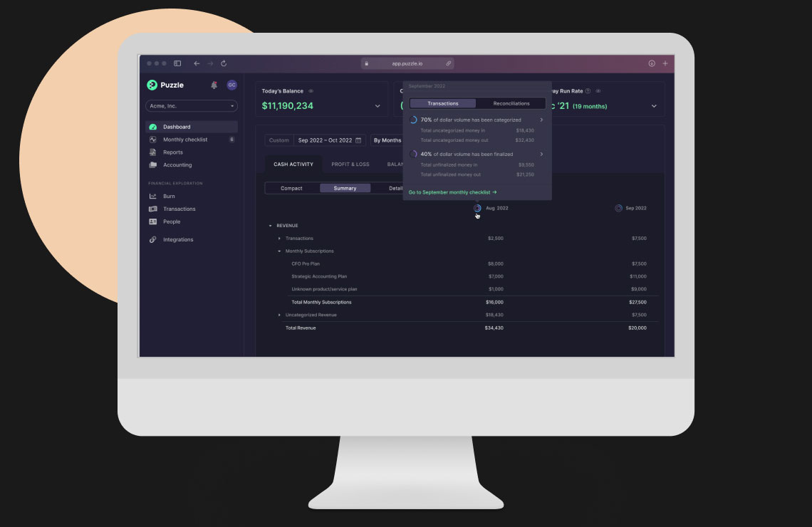
When I joined Puzzle in 2021, there was a basic design system lacking formalities. It was littered with incomplete components, used color and type not associated with variables, and was giving the entire product a lack of identity.
Puzzle needed a design system to support internal and external functions:
- Internally - To help our frontend and design teams collaborate easier
- Externally - To ensure a harmonious and seamless user experience
I got started on a new design system, and to keep in the ‘puzzle’ theme, named it Jigsaw.
Problem
uzzle’s rapid product growth led to user experience inconsistencies across the product and internal confusion regarding intention of components.
I interviewed frontend developers on the team and did a UI audit of our product
What I found:
- Inconsistencies across the platform
- Divergent patterns
- Conflicting guidelines
- Duplication of components
- Long-drawn delivery due to underutilization of design systems capabilities
Building the foundation
The foundations of Jigsaw supports the brand logo, spacing scale, typography, color system, icons, and interactive components.It was important for the new design system to support a large number of colors and type, as our previous and limited design system meant we were often supporting custom styles in Figma and the codebase.

Building blocks for components
Creating components
Each component, a collection of reusable interface elements, came in multiple variants to support different sizes, states, and color palettes. It was critical to define the differences between component classes so that design decisions are efficient and accurate based on the context of the page.

Select components in different sizes and color stories
Structuring patterns
Patterns were created to show reusable component combinations that address common user objectives. Patterns were created after components had styles applied to them so that if something changed in the future, the styling and components would waterfall into patterns. While not every possible pattern was developed, this library served as the basis for our users most common objectives.

Patterns were created to build a library of complex UI elements.
Challenges
Time & resourcing
- Being at a startup means working with finite resources. What I saw as a huge opportunity for our team and our users was also a time commitment. I had to advocate for the design system as an investment, and I also had to sacrifice my own design time to build it when I was the only designer on staff.
- Solution: I started a daily one-hour virtual meeting called “Office hours” which I would dedicate to working on the design system. I opened up this hour to anyone to swing by and ask questions. Product managers and developers would stop by to ask questions about other matters, but this meant I could also get ad-hoc input on the system.
Documentation
- There are plenty of great documentation examples when it comes to design systems, but building reference libraries isn't in scope for our startup. However, we still needed some guiding principles on when to use styles and components.
- Solution: Directly in the design system, I provided different examples of when to use certain styles. I also identified common patterns across the site for future reference when building features. Each component came in several variants so designers could quickly swap states and color stories to provide realistic screens to developers.

Type with appropriate coloring and styling depending on usage

Component usage notes were particularly helpful to specify how something should be used in practice
Transitioning
- At the time the design system was built, we did have some variables. The existing colors and typography wasn’t robust enough for what we were building, however, which meant a lot of styling was being manually entered, even if it was used in multiple places.
- Solution: I took our existing variables and mapped them against the new design system to build a visual regression chart. This could help developers staffed on the project understand what needed to be added as new vs updated.

A visual regression chart was handed to developers to ensure a smooth integration of the new design system
Reflections
Launching Jigsaw solved a major issue in our designer-developer workflow. Having a robust design system meant that designers would save time while ideating and polishing screens, and developers were more empowered to make incremental changes without major design input.